New Business cards!
As a fresh company you need a logo, some vision and those dull business cards off course.
Just for those interested:

The business cards. There are two version: one with a map of Haarlem on the backside, and one with a Wold map, just because old maps are so beautiful :-)
In 1642 the city council commissioned the surveyors Hendrik Duijndam and Peter Wils to design a new expansion on the north side of the city. So the Haarlem map is a copper engraving from Joan Blaue in Amsterdam 1649 based on that survey. The world map is a pretty famouse one from Willem Bleau (around the same time as the Haarlem map).
About the logo:
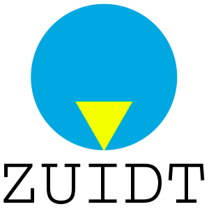
- it’s supposed to be an abstraction of a compas
- with ‘easy’ colors (#00aadd and #ffff00)
- and easy forms: a perfect circle and triangle (1/3 of circle height)
There is also a full text one:
  .-''-.    Zuidt
 /      \   Richard Duivenvoorde
|  ____  |  zuidt.nl
 \ \  / /   richard@zuidt.nl
  `.\/.'    ++31(0)630972509
 Z UI D T   rduivenvoorde skype/jabber
And one to be use when we need a fancy prompt, or a banner for a server:
blue='\e[0;36m' # 36 cyan
yellow='\e[1;33m'
NC='\e[0m' # No Color
echo -e "${blue}"
echo -e "   .-''-.   | Zuidt"
echo -e "  /      \\  | Richard Duivenvoorde"
echo -e " | ${yellow} ____${blue}  | | T: +31(0)630972508"
echo -e "  \ ${yellow}\  / ${blue}/  | W: www.zuidt.nl"
echo -e "   \`.${yellow}\\/${blue}.'   | Skype: rduivenvoorde"
echo -e "${NC}  Z UI D T"
echo ""

Cool he :-)
About the ‘vision’. I think transparency and openness is a good thing. And I hope that a business ran on those principles can survive in an eco system where a lot of animals think or do the opposite (while I agree that some little ‘secrets’ here and there are the oil that make social interaction more pleasant... )
About Simplicity: Albert Einstein once said: “Any fool can make things bigger, more complex, and more violent. It takes a touch of genious - and a lot of courage - to move in the opposite direction”. Though I do not even have a fraction of the brainpower of mr Einstein, I believe in smaller standardized entities that work together.
Last faq: why ZUIDT with ‘dt’ instead of ZUID? For english speakers the dutch word ‘zuid’ means ‘south’. That is because I like short names, preferably 4 chars. BUT these 3card domain names are all eaten by domain-squatters, so this one, in combination with my impression that it sounds a little ‘old fasionned’, like ‘Bleau’ instead of ‘Blauw’ makes it for me ok.
Ok, let’s go, and beware here be dragons
